Activity 05
Spatial statistics
| Assigned | Due | Submit |
|---|---|---|
Mar 31, 2026 |
Apr 7, 2026 |
Introduction and context
In 1983, under the supervision of archaeologist Anabel Ford, the ancient Mayan city of El Pilar was discovered on the border of Belize and Guatemala. Eventually, the El Pilar Project led to an extensive survey of archaeological sites across Mexico, Guatemala, Belize, Honduras, and El Salvador. Using tools from the ArcGIS Pro Spatial Analyst toolbox (and adapted in part from this tutorial on spatial analysis in archaeology), you’ll run a series of spatial statistical tools and ultimately use them to identify clusters of “hot” and “cold” spots in the archaeological sites data, based on attributes like elevation and population.
Set up your workspace
Set up your workspace in a way that makes sense for you. At minimum I recommend including at least a data folder where you can store all your source data.
Before proceeding to the next section, create a new ArcGIS Pro project and save it somewhere sensible in your workspace.
Download and prepare the data
Click here to download the data.
You could also download it from the S: drive:
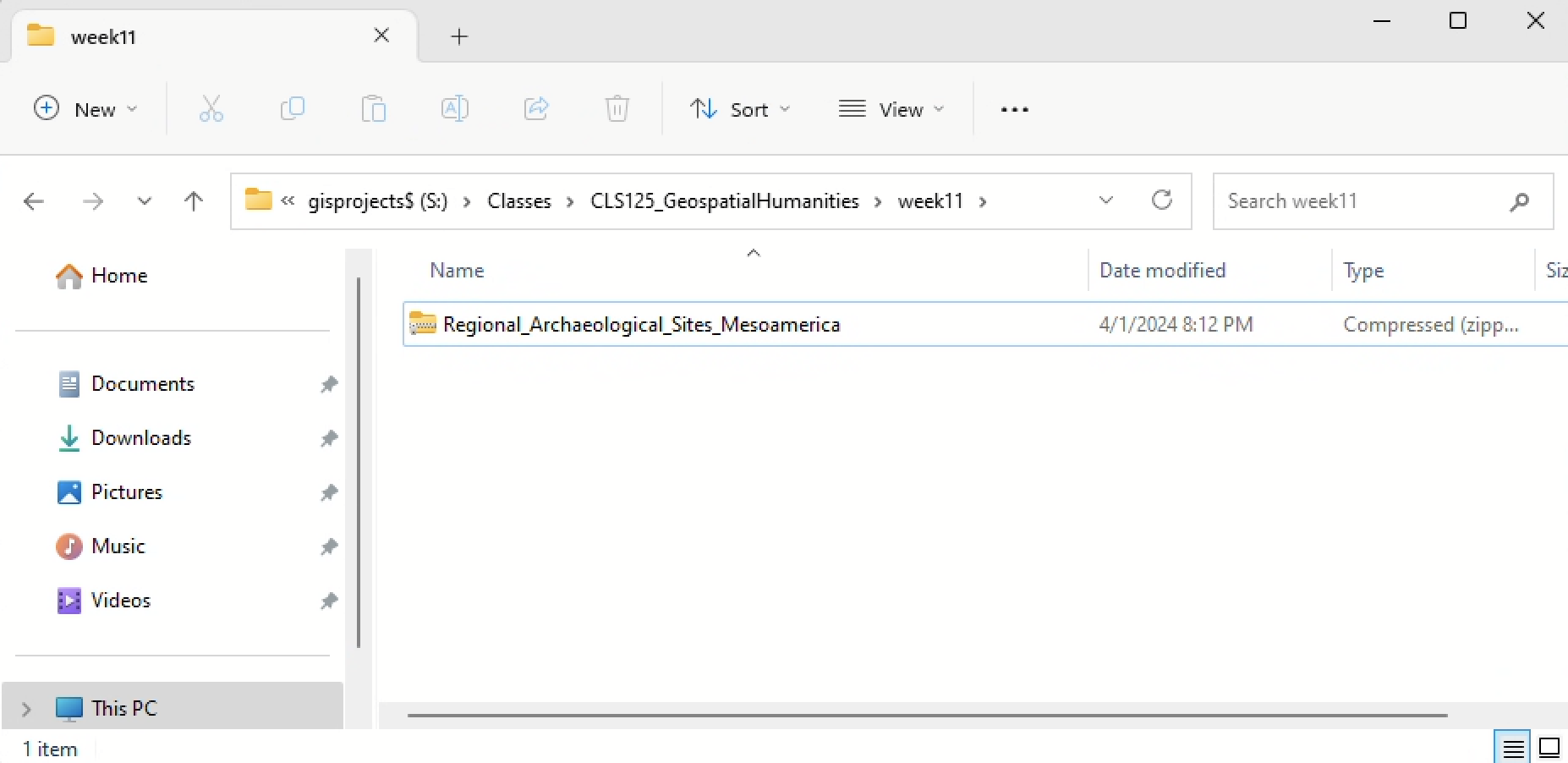
Once it’s downloaded, unzip and load it into your new ArcGIS Pro project. You should see something like:
The layer has quite a long name. Rename it to something like sites.
Take a moment to inspect the data. Open its attribute table and scroll around. From looking at the field names, can you tell what information is represented here? If not, how would you
Now open the sites layer’s properties. Navigate to the “Source” tab, and unfold the “Spatial Reference.”
Q1
What is the geographic coordinate system of your sites layer?
Our first step is always checking whether the data is projected. Since in this case, it is not, we need to project it.
Let’s project the data to Mexico ITRF2008 UTM Zone 16N_1:
- In the Analysis tab, click “Tools”
- “Data Management Tools” ➡️ “Projections and Transformations” ➡️ “Project”
- Set the parameters system like so:
- Input =
sites - Output = name the file
sites_projected - Output Coordinate System =
Mexico ITRF2008 UTM Zone 16N_1
- Input =
Once you’ve projected the data, remove sites so that only sites_projected remains.
A null hypothesis
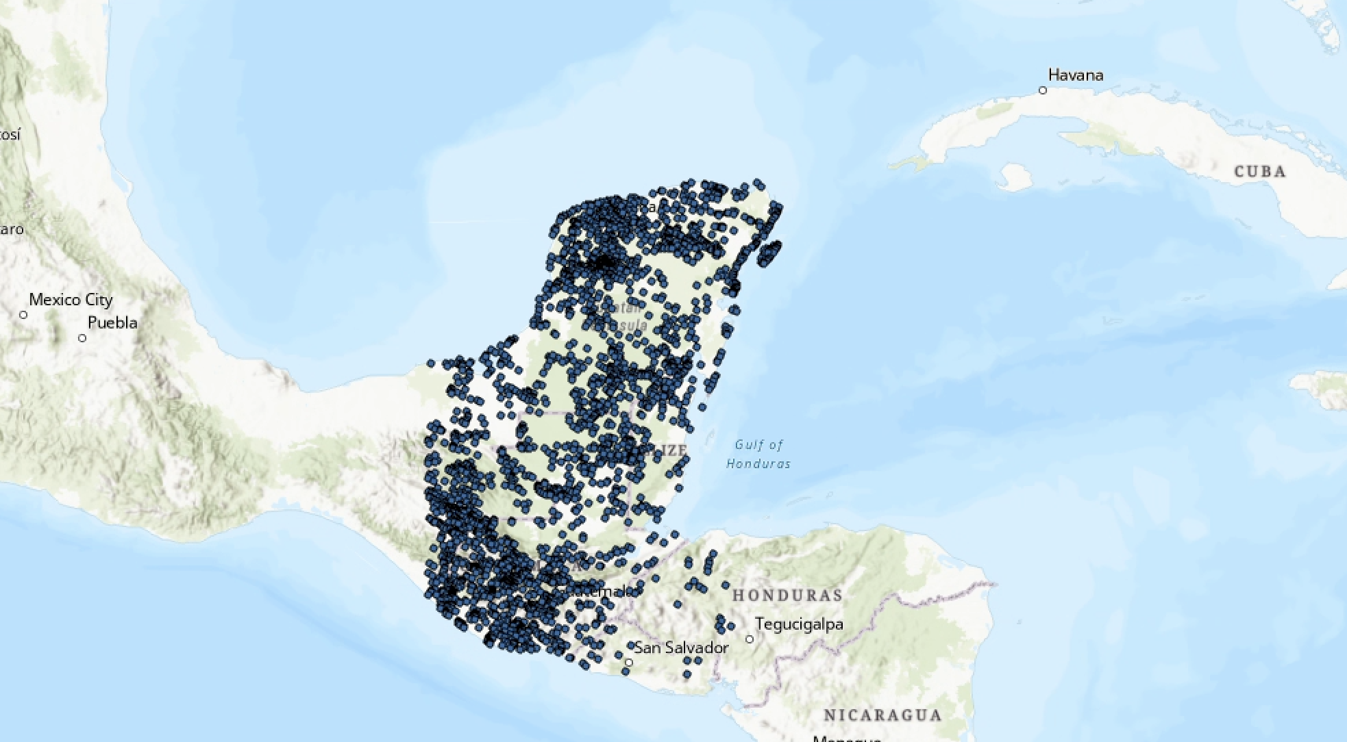
Now that we have our data plotted on the map, we can start to dig into analyzing its distribution. What kinds of spatial patterns emerge? And what can we learn about ancient cultures and people from them?
It’s always wise to begin from a hypothesis. In our case, the null hypothesis—or the assumed hypothesis that we’ll try to disprove—is always going to be that the spatial data in question is dispersed randomly.
In our specific case, the null hypothesis could be stated like so:
Archaeological sites in the study area display random distribution.
Just eyeballing the sites—and based on what we know about how humans settle—it seems likely that the null hypothesis is wrong.
How can we rigorously confirm this observation using more than just our eyeballs? And could spatial data help suggest the character, quality, and reasoning for non-random clustering?
Nearest neighbor index
The Nearest Neighbor Index (NNI) measures the distance between each feature centroid and its nearest neighbor’s centroid location. It then averages all these nearest neighbor distances. If the average distance is less than the average for a hypothetical random distribution, the distribution of the features being analyzed is considered “clustered.”
In the “Analysis” tab, click “Tools” (ensure “Toolboxes” is selected underneath the search bar). Then “Spatial Statistics” ➡️ “Analyzing Patterns” ➡️ “Average Nearest Neighbor.” Set the parameters like so:
Euclidean distance is measured between two points “as the crow flies,” while Manhattan measures distance between two points along axes at right angles.
- Input feature =
sites_projected - Distance method =
Euclidean - Check “Generate Report”
- Click “Run”
When the tool finishes running, click “View Details” and then click the link for the report file. (The report file should automatically be saved to your ArcGIS Pro project workspace.)
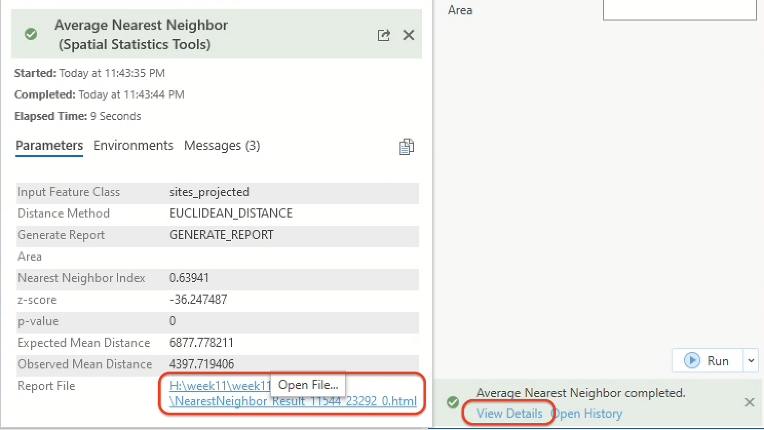
You should see an html page open up:
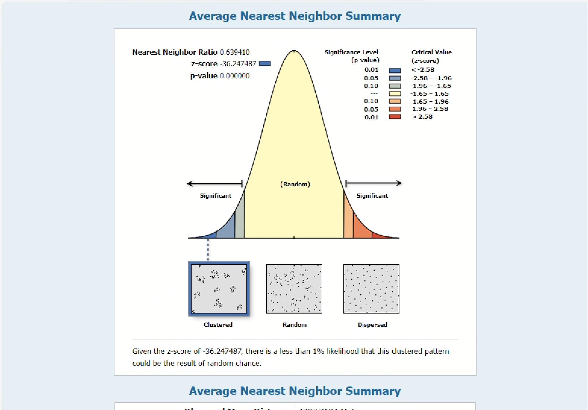
The Observed mean distance is calculated from the sites_projected data, while the Expected mean distance is what would be expected for our null hypothesis, or a truly random distribution of points. If the index, or average nearest neighbor ratio, is less than 1, the pattern exhibits clustering. If the index is greater than 1, the trend is toward dispersion.
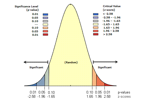
You can also refer to the p-value and z-score to assess whether the clustering seems random or not:
- Small p-values indicate a low probability that the observed spatial pattern is the result of random processes
- Z-scores are standard deviations (or measures of the spread of the distribution). If, for example, a tool returns a z-score of +2.5, you would say that the result is 2.5 standard deviations
Both z-scores and p-values are associated with the standard normal distribution, e.g.:
Based on the report we got from the NNI, it seems mathematically unlikely that the clustering in our data was the result of random chance. Take a moment to look through the results more carefully.
Q2
Paste the values for the average nearest neighbor summary.
NNI measures relationships exclusively based on distance. A slightly more detailed way to determine clustering would be to test for spatial autocorrelation, or the degree to which a feature is correlated with itself based on certain attributes. Following Waldo Tobler’s first law of geography, the spatial autocorrelation tool—also known as Global Moran’s I—measures spatial autocorrelation based simultaneously on location and feature values.
Looking at subareas
This archaeological data spans multiple countries. We might want to divide it into smaller areas. How should we define those “subareas?”
What would happen if we analyzed this data at the scale of national boundaries, instead of the actual corpus of archaeological sites?
Let’s try that out by chaining together a series of selection queries.
- Head over to Natural Earth and download the Admin 0 – Countries data.
- Using the same workflow as you used for the sites, project the data and rename it
countries_projected. Remove the original countries layer so that the only layers in your map aresites_projectedandcountries_projected.
At this point in the tutorial, I turned off the standard ArcGIS Pro base map layers. Doesn’t make a difference if you do that or not, but just be aware because it will affect how my screenshots look compared to yours.
While the “Select” tool in the Map tab is activated, click on Mexico. A blue line should appear around it indicated that it’s selected.
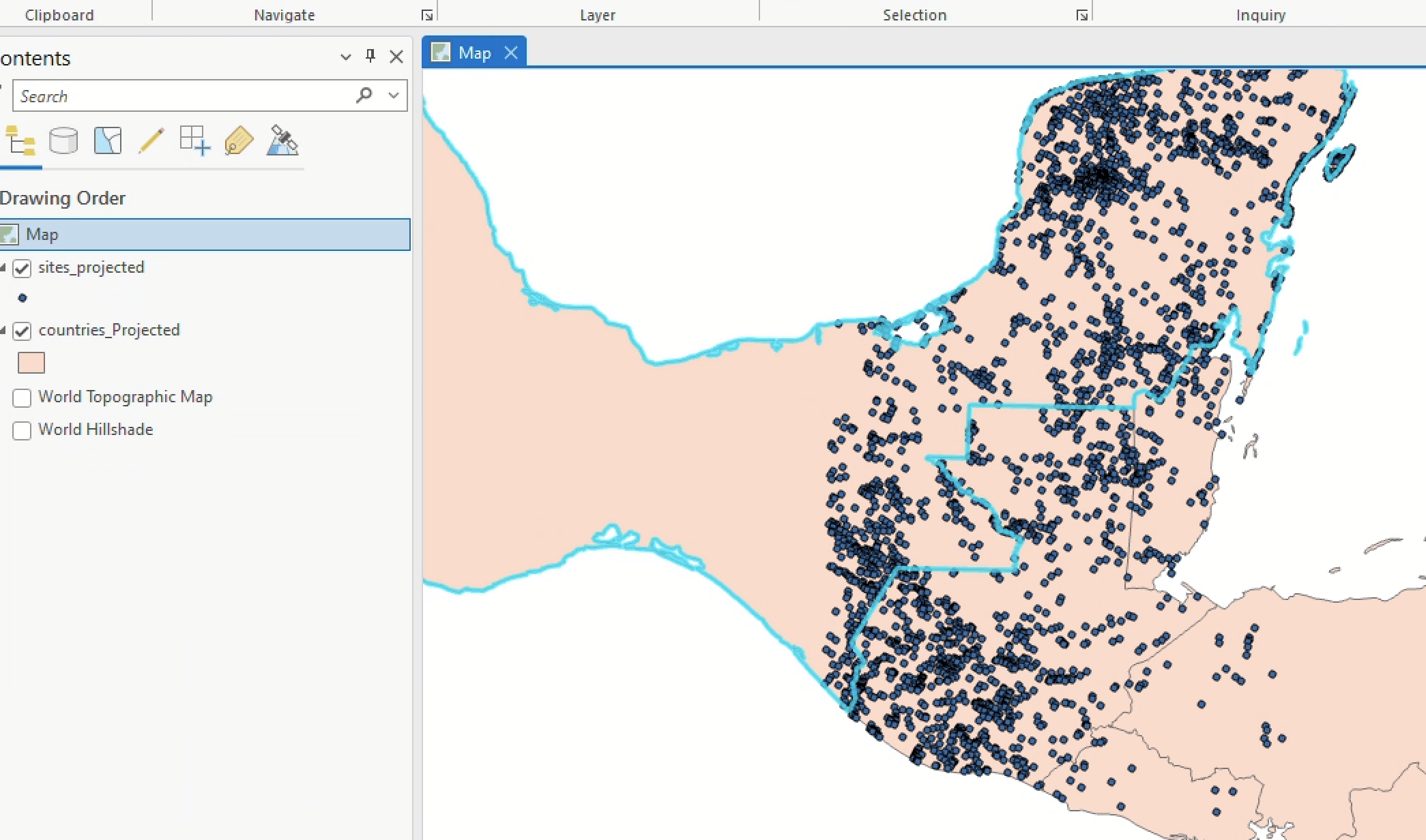
Figure 6 Now, in the Map tab, click the “Select by Location” tool. Build the following query:
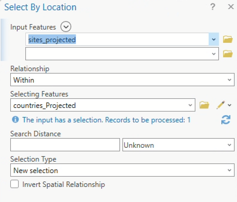
Figure 7 The output should resemble:
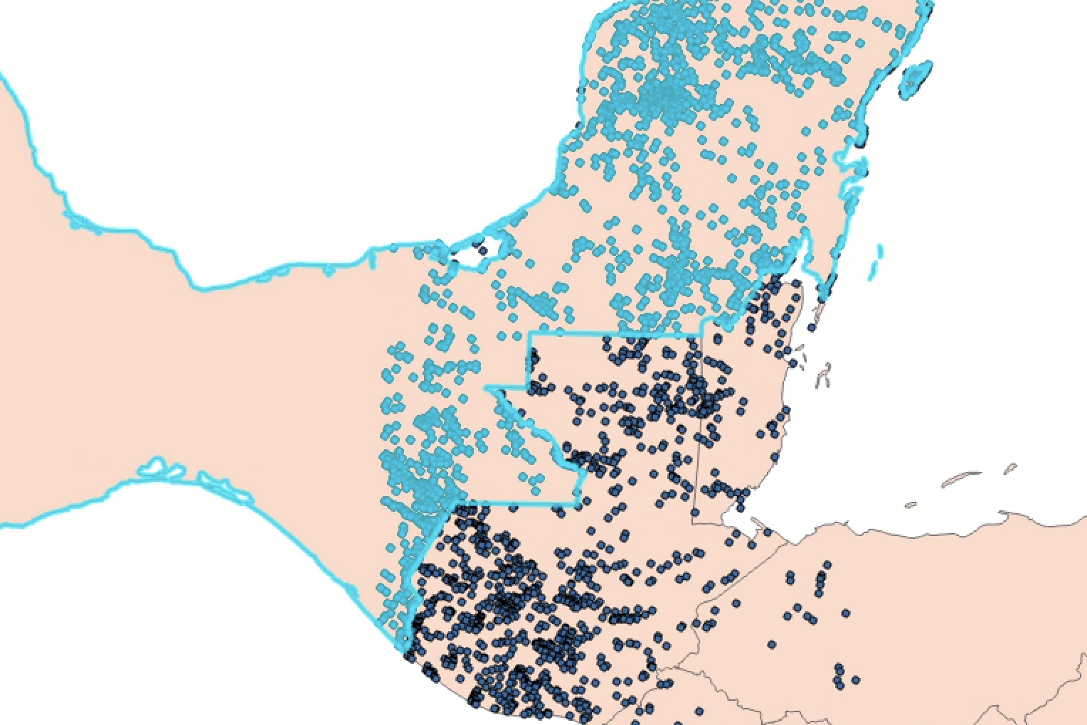
Figure 8 Now only the points that fall within the country boundary of Mexico are selected. Go ahead and re-run the NNI tool, taking care to ensure only those selected points are included in the analysis, as in the screenshot below.
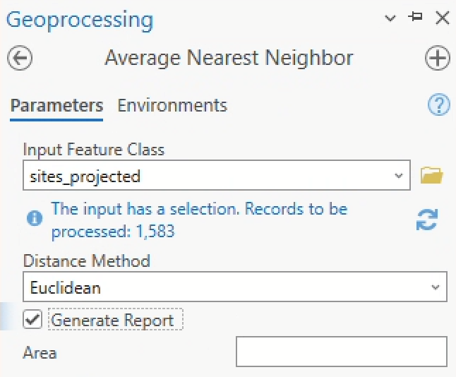
Figure 9 Check the
htmlreport again. Make note of the Nearest neighbor ratio, the p-value, and the z-score.Now, repeat this process for both Guatemala and Belize.
When you’re done, you will have generated 3 new NNI reports, one for sites in each country.
Q3
Compare the nearest neighbor ratios, p-values, and z-scores for Mexico, Guatemala, and Belize. What were some of the major differences between those values for each country? What do you think was the cause of the difference?
Q4
What’s another kind of boundary layer that might make more sense than modern countries to evaluate the NNI?
Finding magnitude with kernel density
The NNI suggests it’s unlikely that clustering in any case here is random. The Kernel Density tool can be useful for identifying particularly pronounced areas of clustering.
As we saw in Lab 04, kernel density calculates a magnitude-per-unit area from point or polyline features using a kernel function to fit a smoothly tapered surface to each point or polyline.
Search for “kernel density” in the geoprocessing pane and enter the parameters like so:
- Input points =
sites_projected - Population field =
NONE - Output raster =
sites_kd2000 - Output cell size = let’s try
1000 - Area units =
square kilometers - Output cell values =
densities - Method =
planar
Click “Run” and you should see something like this (you might have to move it above your countries_projected layer and turn off the sites_projected layer to really see it).
The output should resemble:
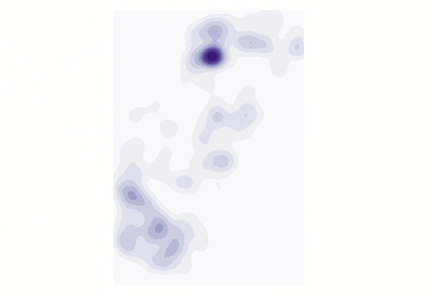
Now we have a raster layer that approximates magnitude of archaeological sites via contours.
In the Symbology pane for this layer, change the number of classes to 5. What do you notice? Now change it to 3.
Let’s turn this raster layer into a vector polygon. This will allow us to overlay only the highest magnitude zones, easily filtering out entire areas of low clustering at once.
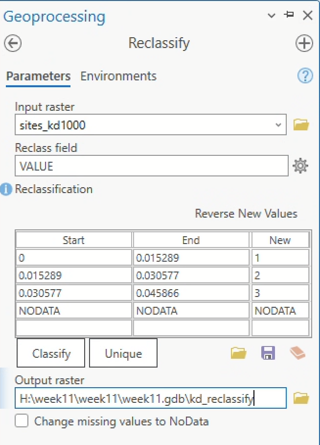
- First, we’ll need to Reclassify it, becaue we can only convert a raster layer to a polygon layer if the raster layer is of
integertype. - In the Geoprocessing pane, search “reclassify” and click on the “Spatial Analyst” tool. You can leave the default values, which should be classified into 3 buckets as in Figure 11.
- Once you’ve renamed the output layer to
kd_reclassify, go ahead and click “Run.” You should see something like Figure 12: - Now that we have a raster layer of integer value, you can convert it to a polygon. In the Geoprocessing pane, search “raster to polygon.” Click on the “Conversion” tool and enter the following parameters:
- Input raster =
kd_reclassify - Field =
Value - Output polygon features =
focus_areas - Check “Simplify polygons”
- Input raster =
- The output should resemble Figure 13:
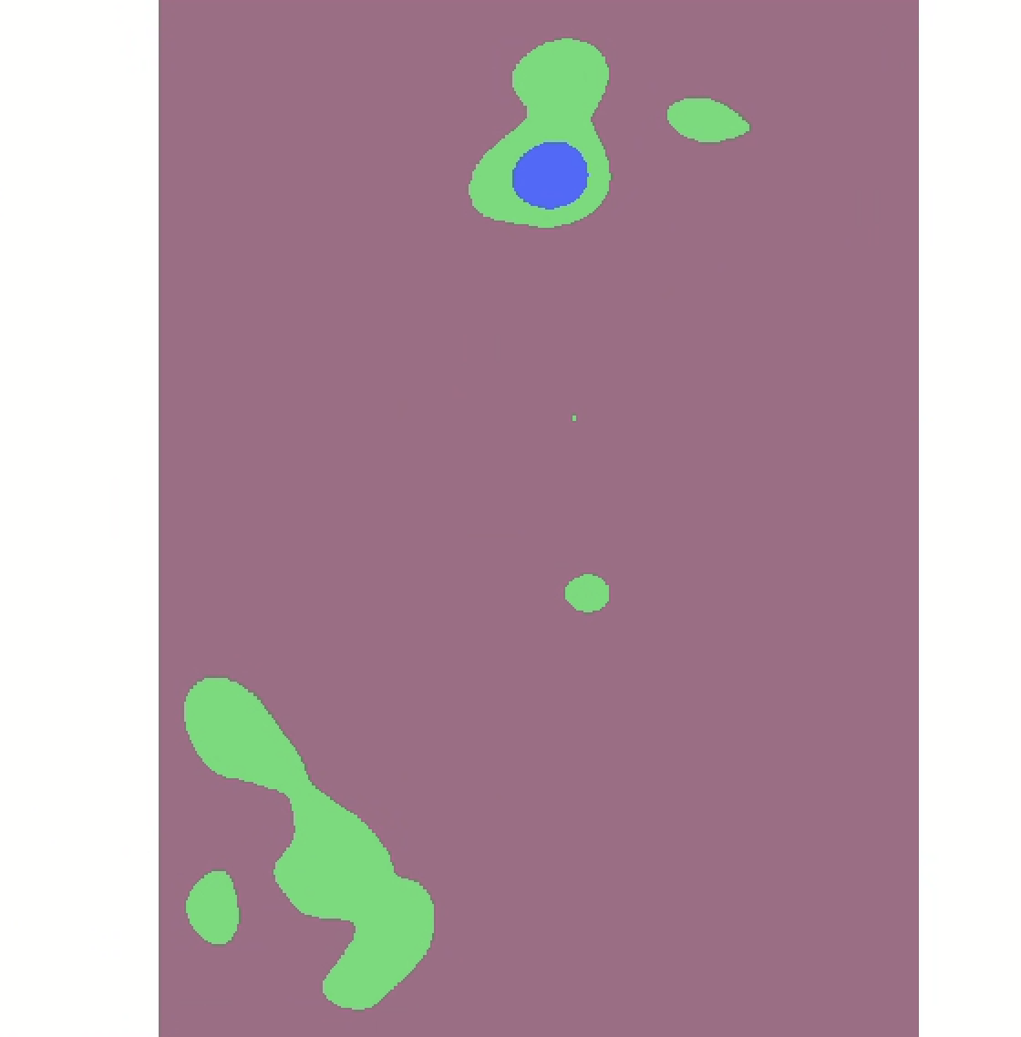
Since we’re only interested in areas of high clustering, you can delete the record of 0 value from the focus_areas file. You can also delete the tiny point. This should leave you with a vector polygon layer containing 6 records that resembles the following:
We could use this kind of layer for all sorts of secondary analysis; for example, what if you wanted to argue for the protection of certain “conservation zones” based on archaeological sites? Turning a continuous surface of points into discretely bounded polygon entities can be a powerful way to make an argument.
Other clustering techniques
Kernel density is not the only way to represent clusters.
Turn on your sites_projected layer, and while the layer is selected in the Contents pane, click the “Feature Layer” tab at the top of the screen. You should see a button for “Aggregation.” Click it, and click “Clustering.”
Zoom in and zoom out. What do you notice about how the clusters change?
Now try setting the aggregation type to “Binning.”
Once you’ve finished comparing the different clustering techniques, turn “Aggregation” off by setting the aggregation type to “None.”
Identifying hot and cold spots
Hot spot analysis is another kind of clustering analysis that identifies “hot” and “cold” spots—or statistically significantly clustered areas of high and low values—based on an input vector dataset.
In order to conduct a hot spot analysis, you need a secondary attribute. The kernel density shows us simple magnitude, but a hot spot analysis will show us the presence or absence of statistically significant qualitative clusters based on some other criteria.
One problem with our sites_projected layer is that we don’t have a useful quality in our attribute table right now. So let’s create one.
Account for elevation
While modern countries might not be the most sensible thing to compare alongside this ancient data, comparing the distribution of archaeological sites against different elevations could be more interesting. Researchers commonly use aerial remote sensing tools for archaeological research, for instance, to identify ancient Mayan settlements in modern Guatemala (Garrison et al. 2011). But do archaeological sites tend to cluster differently depending on their altitude?
To find this out, let’s introduce a digital elevation model (DEM) into the mix.
I downloaded and pre-processed the elevation data that you’ll use from EarthExplorer, a free website from USGS through which you can get all sorts of remotely sensed data. For this activity, you do not have to download data from Earth Explorer yourself—instead, you can copy elevation data from the S: drive.
By the way, this is probably how you’ll download elevation data if you need some for your final project. This video is short and clear about the process of downloading via EarthExplorer. If you need to download a bunch of DEMs (I think I downloaded around 40 for this activity) you should try to use the “bulk download” tool.
You might be getting to a point in the semester where your H: drive is running low on space. Especially since final projects are in swing, consider deleting old files.
From the S: drive, copy the folder dem_projected into your workspace (it may take a minute or two to copy over) and add it to your map.
If you’re asked to “build pyramids,” you can say yes. Loading the data will just take a little longer. Building pyramids improves raster layer rendering in ArcGIS Pro.
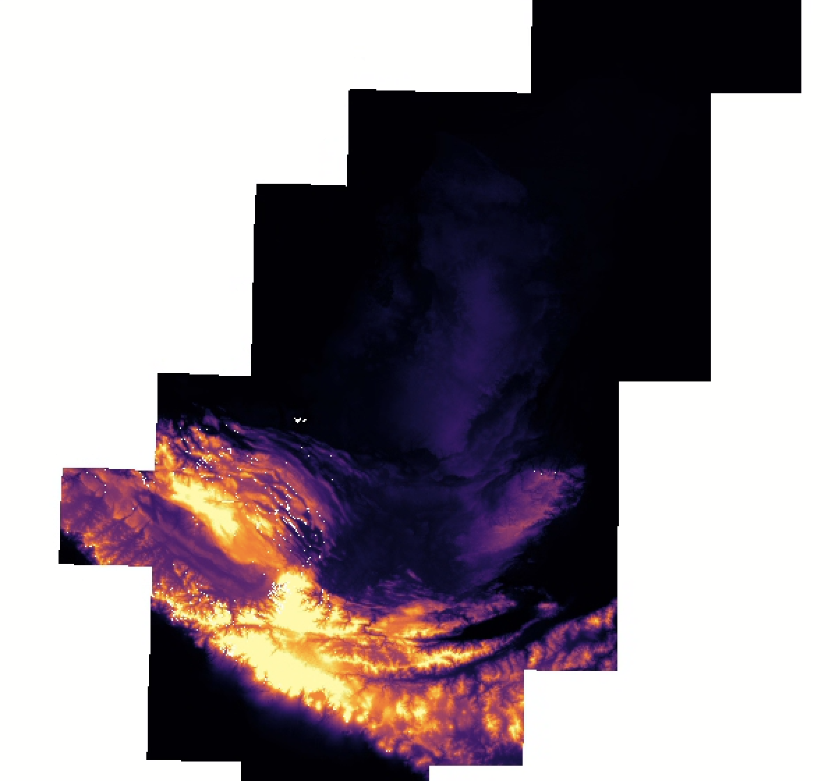
Once the DEM is loaded, you should see something like this:
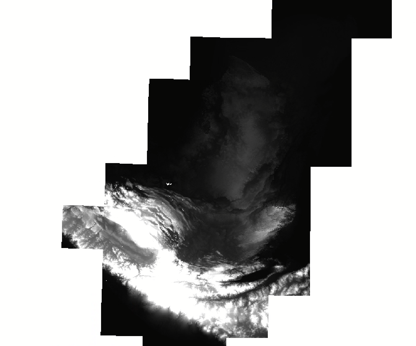
Let’s get this looking a little better. Click on the dem_projected layer in the Contents pane, then click the “Raster Layer” tab in the banner. Set the “Resampling Type” to Bilinear, the “Stretch Type” to Percent Clip, and stretch the data along a color ramp that works for you. I chose this one:
Now open the attribute table for dem_projected. Scroll through to get a sense of what it contains.
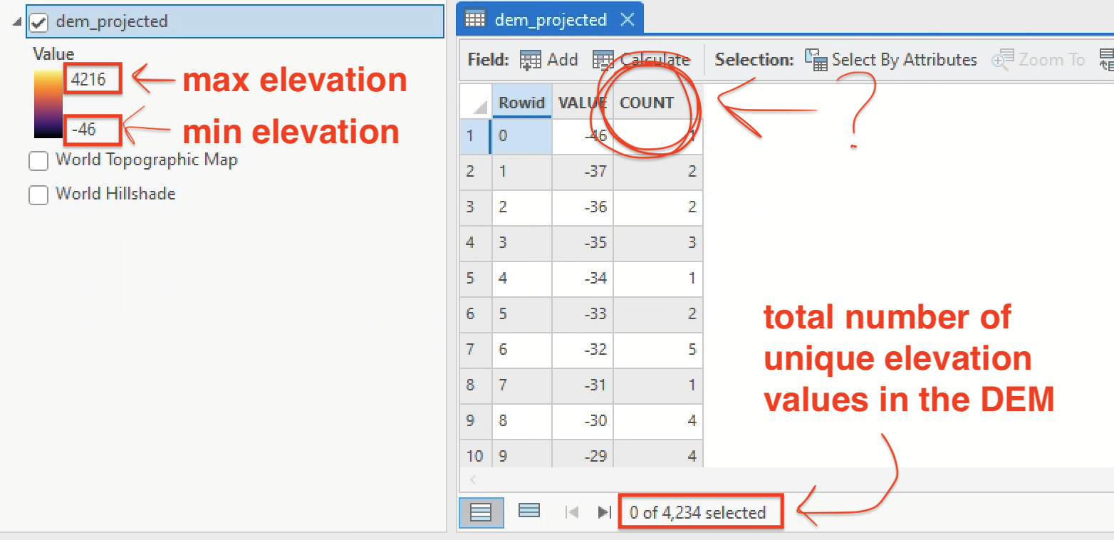
Q5
If the VALUE field refers to elevation in meters, what do the values in the COUNT field refer to?
Creating an elevation field
Let’s create a field for elevation in our sites layer by using the Extract Values to Points tool. This tool extracts the cell value of a raster based on a set of point features and records the values in the attribute table of an output feature class.
Search for “Extract values to points” in the Geoprocessing pane and set your parameters to:
- Input point features =
sites_projected - Input raster =
dem_projected - Output point features =
sites_elevation - You can leave both boxes about “Interpolate…” and “Append…” unchecked
Click “Run” and the new layer should appear in your contents pane. It should resemble your sites_projected layer exactly, but if you open the attribute table, you’ll see a new field called RASTERVALU.
Q6
Why did some records get processed with a <NULL> value and was it the same reason for all <NULL> values? (You might need to compare the sites_elevation layer against the dem_projected layer to answer this question.)
Test a hot spot analysis
Now that we have a sites layer with elevation values in the attribute table, we can run a hot spot analysis. Search for “hot spot analysis” in the Geoprocessing pane and select the tool “Hot Spot Analysis (Getis-Ord Gi*)“. Set the parameters to the following:
- Input feature class =
sites_elevation—Make sure your selection is cleared, the input should not have a selection - Input field =
RASTERVALU - Output feature class =
elevation_hotspots - Conceptualization of spatial relationships = Leave it as
Fixed distance bandfor now - Distance method =
Euclidean
Click “Run” and examine the output. You should see something like this:
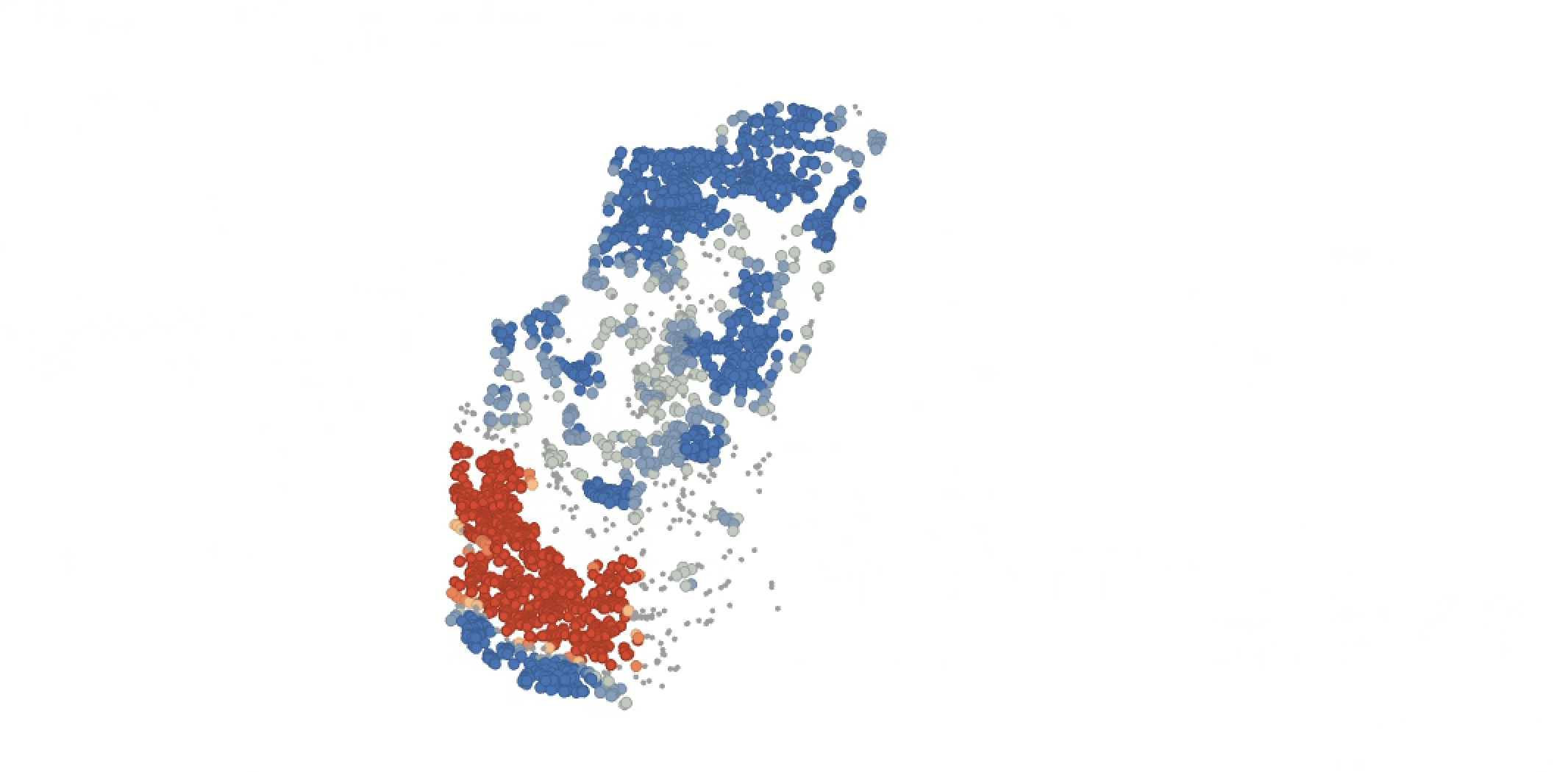
Q7
What is the Gi_Bin Fixed value of the points categorized as “Not Significant?” How is that value being computed and why is it not considered statistically significant? You can reference ArcGIS Pro’s description of hot spot analysis to answer this.
Adding population into the mix
The results of the hot spot analysis for elevation should not be surprising at all. Low elevation values (e.g., “cold” spots) appear clustered with a high degree of confidence, while high elevation values (e.g., “hot” spots) appear clustered with a high degree of confidence. What we’re seeing is basically a confirmation that the tools works as expected.
Here’s a potentially more interesting question: throughout our Central American study area, how do archaeological sites cluster relative to modern human settlement? e.g., will we find that areas inhabited thousands of years ago tend to continue being inhabited today, or vice versa, or some mixture of both?
From the S: drive, copy the zipped data gpw-v4-population-density-rev11_2020_2pt5_min_tif to your workspace. Unzip it and add the TIF to your map. You should see the following:
This data is from NASA’s SEDAC (Socioeconomic Data and Applications Center). It’s a global estimate of population density at a 2.5 arc-minute resolution. One degree on the globe is composed of 60 arc-minutes. For comparison, our DEM data was downloaded at 1 arc-minute (about 30 meter) resolution. You can download SEDAC population estimates at various scales and temporalities; this one is 2.5 arc-minutes for the year 2020.
Rename the SEDAC data to population before proceeding.
Let’s run that Extract Points by Value tool again to attach population value to our points. Your parameters should be set as:
- Input point features =
sites_projected - Input raster =
population - Output point features =
sites_population
Leave both boxes unchecked and run the tool. Once it’s run, open the attribute table and look around.
Q8
What is the highest value in the RASTERVALU field of the sites_population feature class?
Now let’s run the Hot Spot Analysis once again, but this time for the sites_population layer:
- Input feature class =
sites_population—make sure no records are selected - Input field =
RASTERVALU - Output feature class =
population_hotspots
Leave the rest of the fields as they are and click “Run.” I flicked my World Topographic Map and Hillshade base layers back on and the result looks like this:
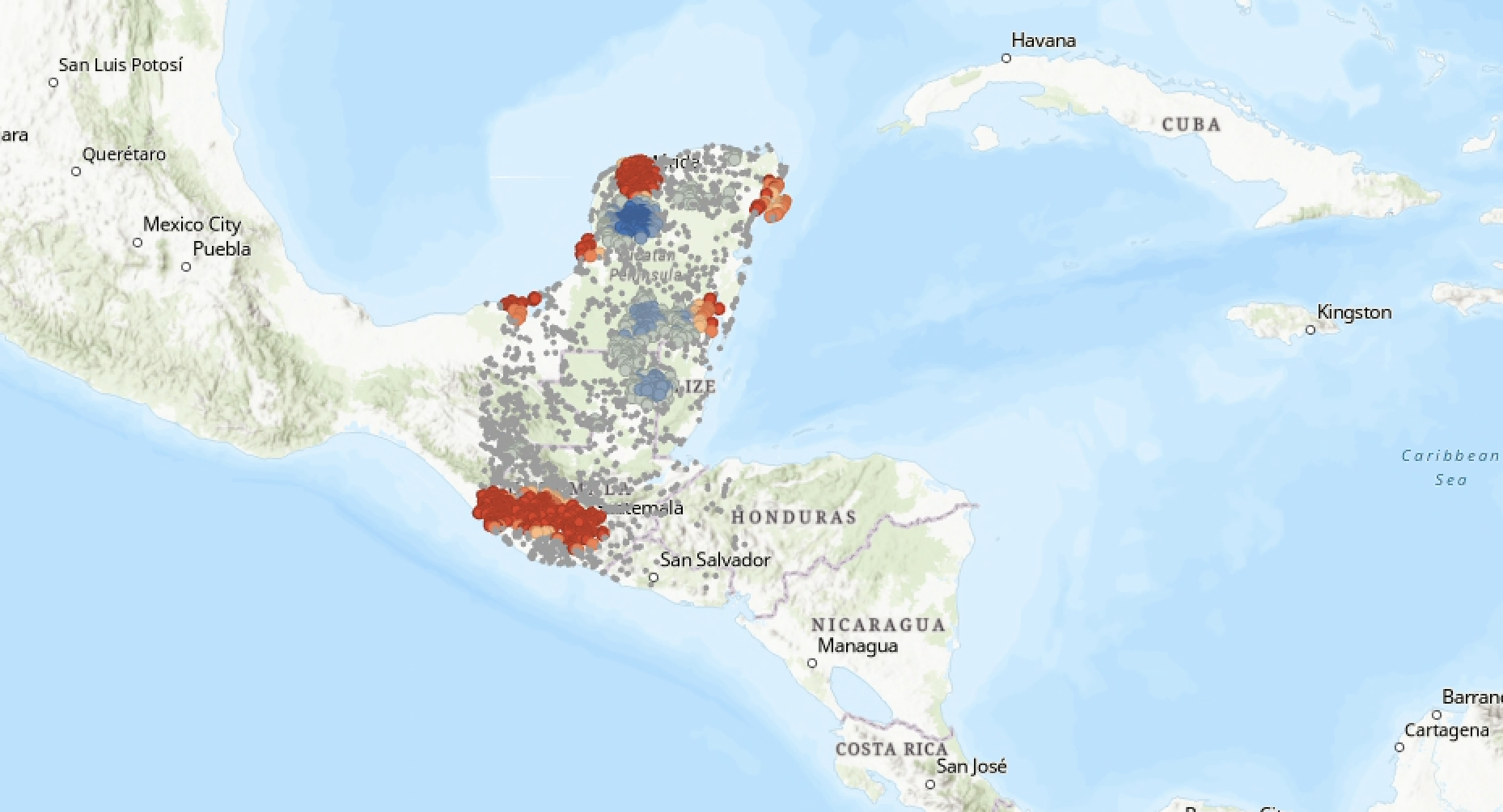
Wow: a very different landscape of statistical significance this time. Since we weren’t just correlating elevation values—which we’d expect to cluster along areas of statistical significance—the population_hotspots actually reveal some interesting patterns.
To conclude this lab, take a moment to compare and contrast a few different hot and cold clusters.
Q9
Compare one 99% confidence “hot” cluster against one 99% confidence “cold” cluster. Briefly, describe the two areas: what sorts of natural and human featutres are in the “hot” cluster versus the “cold” cluster? Why were they assigned the values that they got?
Q10
Now compare one 90% confidence “hot” cluster against one 90% “cold” cluster. Again in 2-3 sentences, make the same comparisons, identifying what kinds of natural/human features as well as your guess as to why they were clustered in this fashion.
Questions and deliverables
| Assigned | Due | Submit |
|---|---|---|
Mar 31, 2026 |
Apr 7, 2026 |
You don’t need to submit a map with this activity—just answers to the questions throughout, submitted in document in pdf or docx format.